
A Swoonworthy Mini Makeover
Happy 2014 one and all! It’s been rather low round here on the blog-post front, but I have an ace excuse, honest….
….drumroll….
…I’ve been writing a book! It’s on interiors (as I don’t really know about anything else) and it will be published this Spring. I won’t say anything more right now as there’s still a few tiny odds and ends to tie up and I want to do a proper post on it, but now I’m not working 90-hour-weeks back to back, and having redressed the work/life balance (and eaten copious amounts of cheese) during the festive break, I’m ready to say a bit more for myself again! Starting with this.
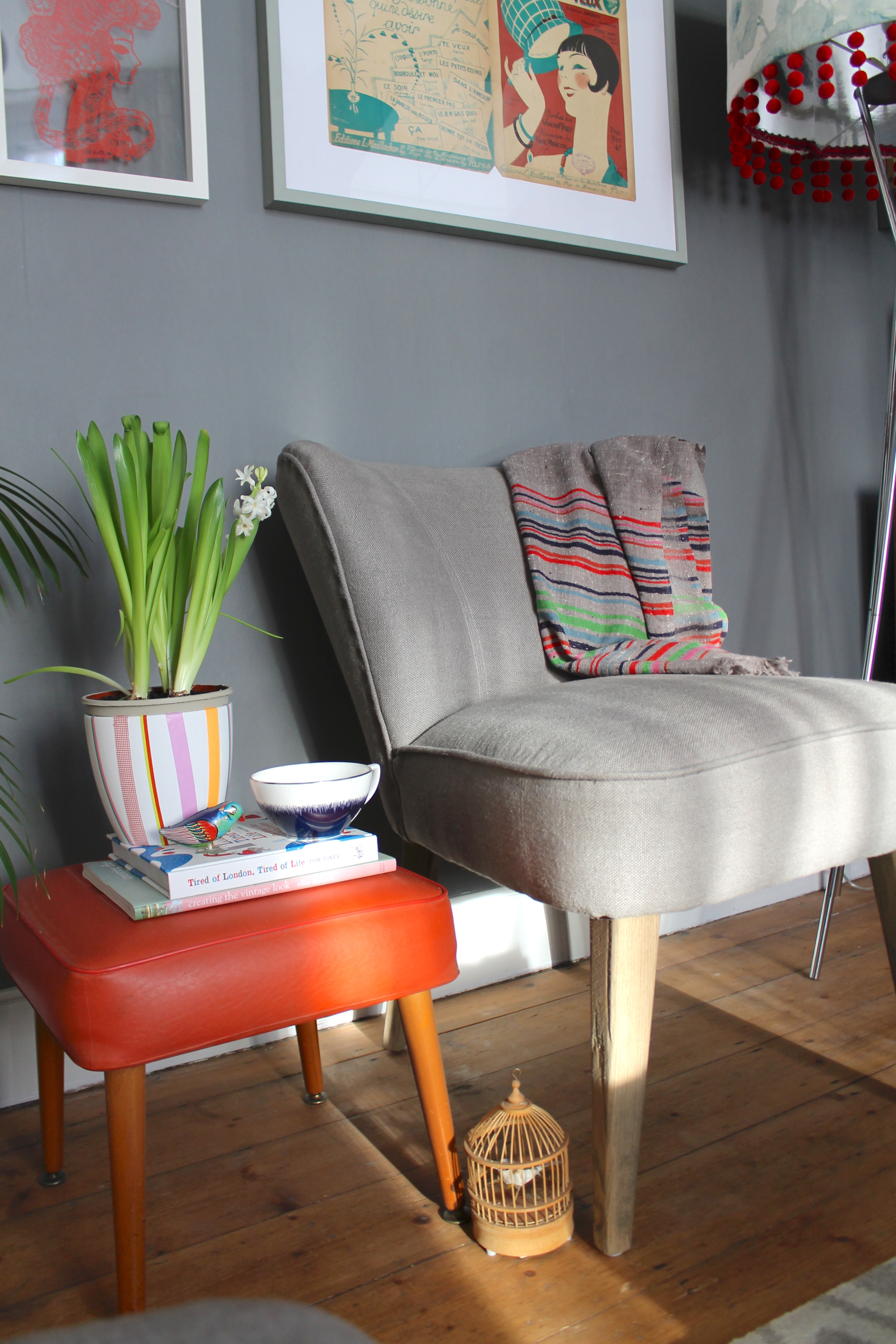
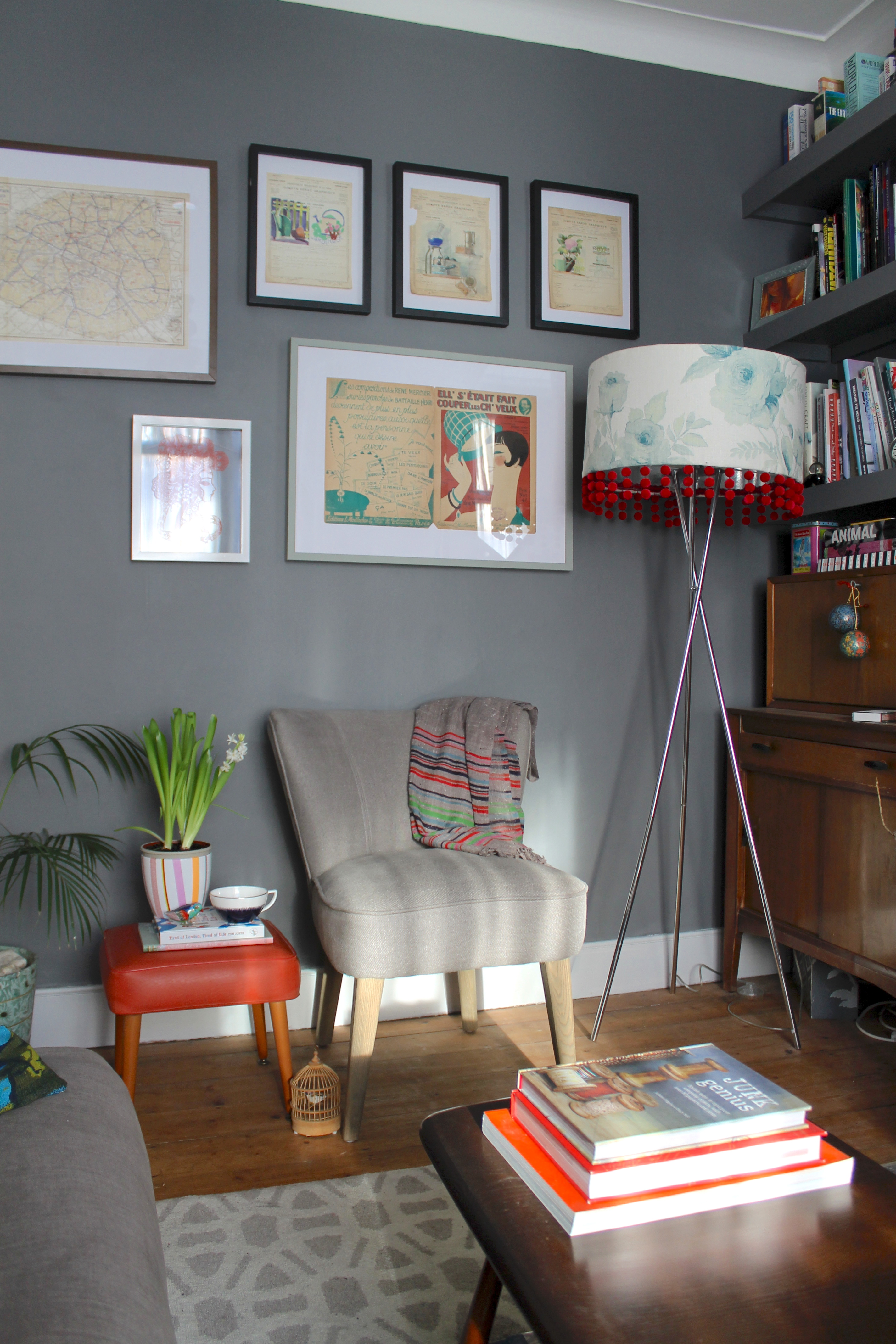
I was recently approached by Swoon Editions, an innovative online furniture company who specialise in limited-batch runs of furniture, ensuring prices are kept low without compromising on design or craftsmanship, and asked if they could tempt me with an armchair from their lovely collection, in exchange for taking a few pics of it in situ at home. As I STILL hadn’t managed to solve my living room armchair dilemma, the words ‘gifthorse’, ‘don’t knock’ and ‘mouth’ sprung to mind. Having failed thus far to find a loveseat or bench the right size (and price) to fit the rather bijou space I had available for said seat, when I clapped eyes on the Milly, I knew she could be the answer: with her diminutive proportions, she would easily fit the gap whilst still leaving space for a small side table, and if in the future I did find the bench/loveseat of my dreams (which after 18 months searching I think only exists in my head), she could comfortably be relocated to the dining room, bedroom or study. I plumped for the grey colourway (natch) to tie her in with the rest of the room, and I think she looks resplendent in her new abode. For me, legs always seem to be an issue when looking at not-a-million-pounds seating: the standard seems to be cheap, clunky veneer-clad ones which screw on rather than being integral to the furniture, and is one of the reasons I’ve struggled with my search for so long. Luckily, the Milly (for she’s a somewhat leggy creature) has legs to die for, created from turned solid oak in a pleasingly matt, weathered finish, and with a mid-century style taper.

I’d been waiting to source a chair before hanging any artwork on this wall, so the arrival of Milly also spurred a picture hanging frenzy. After finally relocating the lovely pieces I picked up last August at the Lille Braderie (rolled up at the back of my dining room food cupboard, obviously – no, me neither), frame sourcing commenced, before a final hanging spree.

Top: Vintage 1940’s exam papers, from Lille Braderie, framed in 20x25cm Black wood block photo frames, £9.60 each, Debenhams. Middle left: Papercut artwork, from a vintage market (which I think is sadly no longer there) just outside the main Greenwich Market , framed in 24x30cm Bacall floating picture frame, £16, Habitat. Middle right: Vintage sheet music cover art (I think), from Lille Braderie, framed in 50x70cm Ribba picture frame, £12, Ikea and painted in some leftover Light Gray emulsion, Farrow & Ball. Bottom: Vintage Paris map, from Lille Braderie, framed in Ikea Ribba frame, as before.

In all the excitement, I also added a little pimp-up to my hyacinth plant pot – having excitedly purchased the plant just before Christmas, I failed to check if I had a suitable outer pot to house it in, and this white one was the best I could find knocking about in the shed. As the plastic inner pot protruded slightly, I sloshed a bit of Farrow & Ball’s Light Gray on it (yes, a bit posh like, but I was actually painting some props in it previously for a client and got a bit carried away with using up the leftovers – see also picture frame, above), then decided to add a few stripes with Washi tape. I decided to go with my little 50’s footstool as a ‘side table’ for Milly (for some reason, despite having zero chairs, I seem to own about five side tables, most of which live in the loft, waiting for their moment to shine downstairs). Its small scale sits well with Milly, and it can also easily be cleared off to double as an additional seating perch when we have more than, um, three people come to visit. I’m now on the lookout for a small square tray to sit on its top to make the table-to-seat transition slightly easier and more robust.
So what do you think? Potentially I’d like to add in a couple more prints, but for now, I think I’m done. Phew! Back soon with book info…
{Images} All copyright Joanna Thornhill. If you wish to use them elsewhere, please include a credit and a link back here.
Disclaimer: Swoon Editions supplied me with the Milly free of charge, but all words and opinions are my own, and trust me, I wouldn’t put anything in my house that I didn’t genuinely love, as I am a total fusspot with a poor poker face.
Beyond the Wall: Paint Effect Canvas Artwork How-to


Inspired by the subtle tones of this image from Dulux’s Collective Passions trend, I selected three closely-related hues – Frayed Hessian 3, Fruit Fool 6 and Chalk Blush 1, and used a wet-brush technique to get a softer blend between the colours. Painting the top and bottom bands of colour first, I then dabbed blobs of the same colours near their edges before filling in the middle band, allowing the paint colours to mix together. To finish, I blended the colours with light brushstrokes, alternating between each colour, as shown in my previous post, ensuring I worked quickly before the colours dried.

In contrast to the wet-brush technique, I wanted to experiment with a higher-contrast alternative. Enter Bermuda Cocktail 2 and Orange Fizz, which together I think create a somewhat retro, West-German pottery vibe. I returned to the dry-brush technique for this, but kept all the brushstrokes horizontal rather than any-which-way, to create a more stripy, bold finish, again swapping between each colour and blending over each other until I was happy with the end result.

And finally, not an artwork in itself, but an accompaniment to one. The boyf bought me this beautiful screenprint for my birthday, by local-to-me artist Anja Jane (do check her out – her work is gorgeous!) and I’d held off framing it as I didn’t want to just shove it in a bog-standard frame. However, I was desperate to pop a couple of things up on my freshly-painted wall and had a perfectly sized Ribba knocking about – then the little cogs in my brain started turning and I noticed how a few of my Collective Passions testers co-ordinated perfectly with it. As a result of my indecision, I painted the inside lip of the frame with Rock Candy 2, slicking Bongo Jazz 3 and 1 respectively to the front and sides. I love how it pops out and thanks to the limited palette within the print, the frame accents it perfectly without vying for attention. After lightly sanding and priming the frame, a couple of coats was enough to do the job.
More crafty delights to follow later this week!
{Images: Photography and projects copyright Joanna Thornhill}
{Psst: wondering why I’m blathering on about Dulux all week? Well, I’m working on an exciting online collaboration with them, exploring their latest SS13 trend, Collective Passions. All week I will be producing blog posts with this trend as the starting point, and then on Saturday 9th March I will be presenting my findings at Meet the Blogger London. To find out more about both, click here.}
All Mapped Out
 At first glance, this might look like a crafter’s freehand stitch-up of the EU. But look again – it’s actually a marine traffic map, depicting the shipping hotspots of northern Europe – rather apt, as we approach a new year, to view the familiar in such a different guise.
 The brains behind this and many other unique glimpses of the world not-as-we-know-it, ITO World (who supply state-of-the-art traffic maps to industry), have recently launched an online galleryselling some of their most aesthetically delightful maps, such as the London bus network (above) by day,
 …and by night…

 …plus open streetmaps from their Year of Edits series, including Moscow and Berlin (above).
A Work of Arc

With Christmas still in full swing there’s been little time of late for blogging or even interwebbing of late. Fortunately I’ve been introduced to several fab new brands this week whilst on shoots, first up being Arc Prints. Selling online throughout the UK, Arc offer a dazzling array of fine art reproductions, capturing all the vintage glory of the original image on matt archival paper. Ranges include animal, botanical, architectural and interiors, travel, costume and ceramics to name but a few, and is quite literally the most comprehensive collection of prints in the WORLD (probably), for incredibly wallet-friendly prices (with most on offer you’d get change from £20). Here’s just a few of my faves:

Owls by Manetti (top) and 19th Century English Cutlery

Henry Bradbury nature print ferns


Parisian Interiors: Francois Chopin

George Wolfgang Knorr shell study


Mrs Mellish Fancy Desserts (quite tempted to buy this one for the name alone)


And finally, these antique doll studies by Lena Cook: quirky cool in a Miss Havisham sort of a way, or just an ickle but creepy?
Stylist’s Own
Stylist's Own is a sneaky peek into the the inspirations, work and insider secrets of London-based freelance Interiors Stylist and Writer, Joanna Thornhill. When I'm not busying myself with shooting, writing features, schmoozing around at press shows and design events or propping for jobs, I can often be found scouring the internet for all its yummy, inspirational goodness, ready to report back here. Along with admiring the work of others, I also share images from my own adventures in the world of DIY, 'craft hacking' and renovating my ramshackle two-bed Victorian terrace in Walthamstow, north-east London.
See my Styling

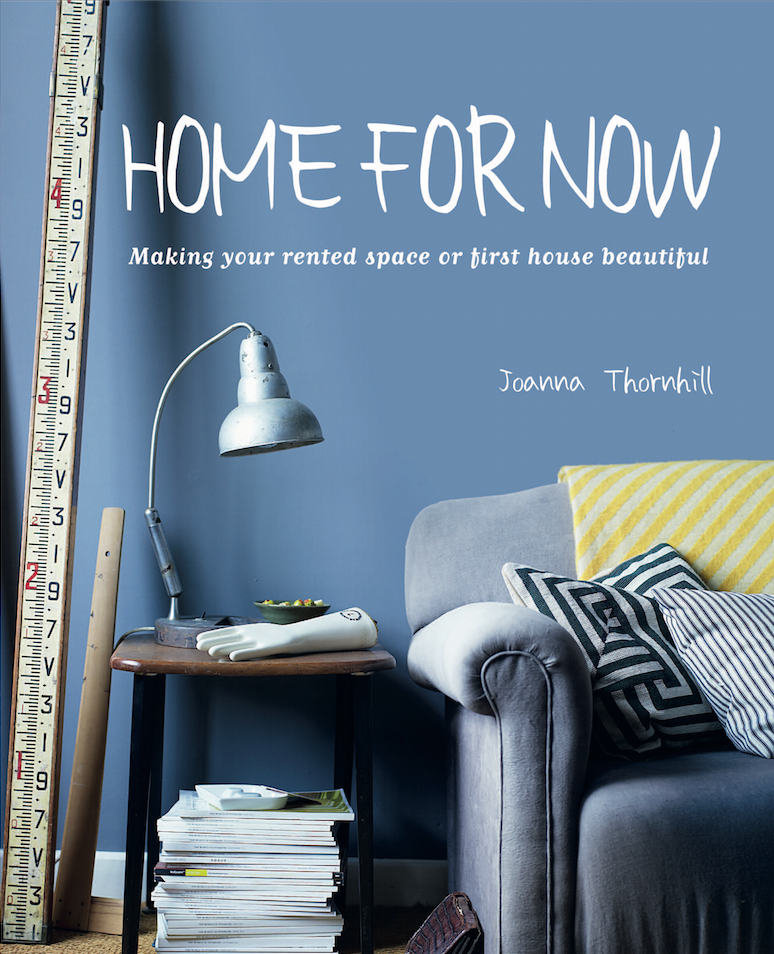
Buy my Book: Home for Now by Joanna Thornhill

My Snaps ‘n’ Pins


Follow me on Bloglovin’:

Badges of Honour:


