
Professionally Stylish: Rodeo Chic Location House

It’s not often you stumble across a property that manages to effortlessly blend Cowboy styling with soft French chateaux faded grandeur. Particularly if said property is an ex-garage just off London’s grotty Holloway Road. But then this is no ordinary location house. Its photographer owner, who purchased the then-derelict Victorian garage in 2004, has achieved a staggering finish in this stunning space. With a huge passion for the rodeo, Cowboy hats and antler chandeliers mingle effortlessly with shabby chic whitewashed floorboards and grand Louis armchairs, all punctuated with industrial modern touches, such as the statement concrete staircase, to keep things looking fresh. After spending a week here shooting the latest Laura Ashley catalogue with stylist Sally Cullen, a case of serious house envy set in. But as I sloped off back to my teensy-tiny flat at the end of the week and let out a wistful sigh, I mulled over all the clever touches that had made this place just so lovely. So here they are:


1. Mix it up. Don’t be afraid of adding several different looks together – it stops things feeling too contrived


2. Sick of overlooking next door’s bins? Try frosting your windows then adding dramatic fretwork panels (see Jali) – the end result equals total privacy and a dreamy, ethereal glow…

3. Think your house has no interesting architectural features? Then think again. By exposing ceiling joists, you can give a nod to your building’s history and add a lovely sense of warmth and texture. Unless there’s just a dusty RSJ lurking up there…

4. Oh, OK, RSJ it is. If you really don’t have any period features, there’s certainly nothing to stop you adding your own. Track down vintage shutters from salvage dealers to add a real wow factor to your windows

5. Leave no styling stone unturned – banish ugly anoraks to a cupboard, and instead utilise your entryway to create a dramatic display, like the cowboy hats seen here


Get The Look:

1. Fight Me antler chandelier, £745, The French Bedroom Company. 2. Extra small bowls by Thomas Hopkins Gibson, £28 each, Liberty. 3. Boiled leather and wood desk, £2,450 limited editon, Tortie Hoare. 4. Patchwork cowhide rug, £360, Tesco. 5. Boutique shimmer cushion in taupe, £20, House of Fraser. 6. Bronze and steel coated antlers, £1,150, Pedlars.7. Scrapwood wallpaper, approx £150 per roll, Piet Hein Eek. 8. Rope light no.46, approx £875, Christian Haas
[Image credits: all property images courtesy of Fresh Locations, apart from all the square shots which are my personal snaps. All Get the Look images taken from the relevant designer/brand’s websites]
The House of St Barnabas

Sometimes in this styling game you get to go to the sort of places you could only dream of visiting in ‘normal’ life, which is both a fantastic perk of the job whilst also being somewhat surreal (many’s the day I’ve spent wafting around utility rooms/spare second guest bathrooms bigger than my entire flat). Usually I find myself in (albeit spectacular) ‘real’ homes, though sometimes, particularly for press events, I’m often stationed in trendy central London bars or hotels, where instead of getting a taste of how the other half live, I instead get a glimpse at where they eat and sip designer mojito’s in their downtime. As I gear up for another early start on a Christmas press show in the morning being held at London’s uber-trendy eaterie Sketch, I’m reminded of another swanky members-only joint I had the priviledge of spending an evening in recently for work.


The House of St Barnabas, originally a refuge for Soho’s homeless community, launched its very own not-for-profit members bar in 2009 in association with luxury-makers Quintessentially, meaning every Cosmopolitan supped by its members goes directly towards the continuing charity work of the House (a most valid reason to knock back a sneaky tipple if ever I heard one). And with interiors designed by Russell Sage, a mishmash of English eccentricity is the order of the day. With original period features clashing beautifully with quirky, modern artworks and bold hued painted and papered walls, the space oozes cool Victoriana with a 21st Century twist.


 [all images taken from Quintessentially Soho]
Professionally Stylish: Shoot Location Houses – Darville Road

It always pleases me when I’m assigned to jobs in location houses that are a mere walking distance from my own abode, as oppose to the usual lengthy commute across town. So after several days shooting in the depths of zone six, a sunny walk to this delightful house in my locale was just what the doctor ordered.
Owned by top interiors photographer Jake Curtis, this pretty slice of Victoriana is an exercise in restrained chic, with light and (off)white being the order of the day, punctuated by slick mid-century (and this-century) modern classics, textural vintage finds and the occasional colour/pattern pop. As a teeny-tiny flat dweller of limited funds, whenever confronted with a dreamy supersized location home, I always try to spot the universal design tips and tricks that could be applied to any space (after the initial ‘oh wow’ phase, shortly followed by a bout of extreme jealousy, before normal service resumes). So what can we learn here?
1. Ceiling lights:


Got a dubiously situated pendant light? Or concerned about committing the lighting crime that upsets interior designers so deeply (i.e. the horror of a room solely lit by a single overhead bulb)? Rather than have your lighting junction box repositioned, consider simply rewiring from its existing spot using an extra-long flex (preferably braided for a vintage-tastic finish). Then simply hang a few strategically placed hooks from your ceiling and place your overhead light in whichever dingy corner seems most in need at that particular moment.
2. Picture shelf:

Curate your own ever-changing gallery space without puncturing your walls with dodgy darts-style holes for a joyfully temporary display of favourite prints, pictures, books, trinkets and baubles, by fitting a slim picture shelf (try Ikea’s Ribba picture ledge, £4.99)
3. Liberate your Prints:

Speaking of photos, do as Jake does and make a statement of any great/arty shots in your arsenal by blowing them up big and proud and putting them in a sleek frame. Far more preferable to a mass-produced High Street print and not much more expensive either. OK, impressive home snaps are easier to come by when you’re a professional photographer, but nothing beats being able to coyly (read: smugly) confess “oh, that? It’s just one of mine, actually” when guests enquire where you got your art from.
4. Child’s Play:

Keep the kiddies learning and the adults spared from having to look at anything in a comic sans style font by framing up an oh-so-classy kid’s poster, like this one featuring classic nursery rhyme Pop Goes the Weasel. Try Made By Girl’s ‘ABC Kids’ Print or Famille Summerbelle’s ‘Learn for Fun’ print range for similar.
{image credits: all via Light Locations}
Stylist’s Own
Stylist's Own is a sneaky peek into the the inspirations, work and insider secrets of London-based freelance Interiors Stylist and Writer, Joanna Thornhill. When I'm not busying myself with shooting, writing features, schmoozing around at press shows and design events or propping for jobs, I can often be found scouring the internet for all its yummy, inspirational goodness, ready to report back here. Along with admiring the work of others, I also share images from my own adventures in the world of DIY, 'craft hacking' and renovating my ramshackle two-bed Victorian terrace in Walthamstow, north-east London.
See my Styling

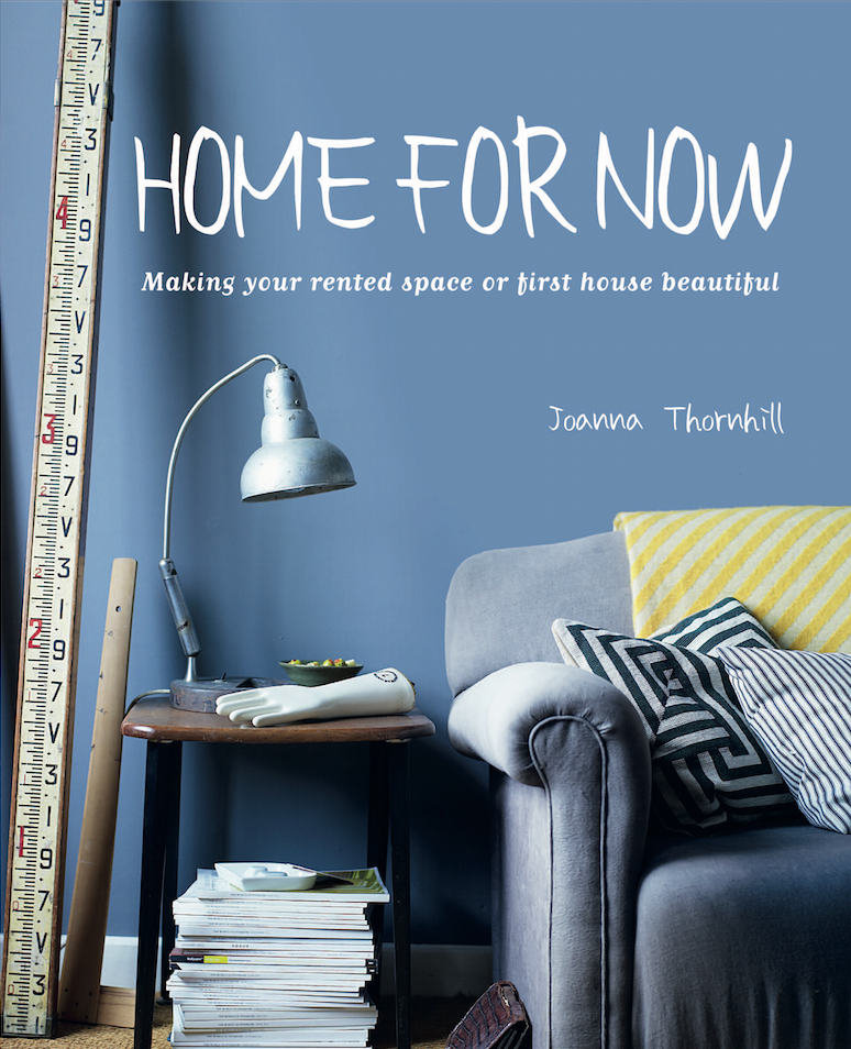
Buy my Book: Home for Now by Joanna Thornhill

My Snaps ‘n’ Pins


Follow me on Bloglovin’:

Badges of Honour:


